


One of the most iconic uniforms in NFL history belongs to the Pittsburgh Steelers, specifically, the modern design adapted from the 1970s through the 1990s. It's a simple, recognizable, historic uniform the Steelers have worn for decades. The black and gold has inspired plenty of imitators and copycats, and has even pushed division rivals to adopt similar traditions. Still, only one true Steelers look carries the history that so many admire.
Apparently, though, not everyone agrees, and everyone's entitled to their opinion. Sports Illustrated recently published its rankings of NFL team uniforms, and the Steelers landed a surprisingly low spot.
SI ranked the Steelers uniform 22nd, just ten spots from last in the league. SI wrote the following:
"The Steelers' uniforms have remained mostly unchanged since the early 2000s, with their primary attire featuring gold pants, black jerseys at home and white on the road. Their polarizing bumblebee throwbacks received a refreshed look in 2025, paying homage to the team's inaugural 1933 season, but were still a bit of an eyesore. Many won't like where they're ranked—as Pittsburgh's widely considered to have some of the league's best uniforms, but to me, they're just meh."
The reasoning is understandable. But the bigger picture does a disservice not just to the Steelers, but to the list itself.
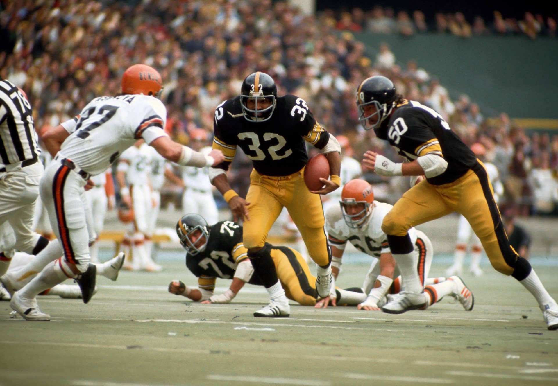
reuters.com,2016:newsml_MT1USATODAY9248714:1652700102
The Steelers Uniform Is Rooted Deep in Pittsburgh
Reading the full list makes one thing clear: history carries little weight here. The ranking, for the most part, treats uniforms as a fashion show rather than a reflection of team identity. Style should factor into these rankings, but ignoring the full picture shortchanges the franchises involved, and that becomes obvious in how SI handled the Steelers.
The Steelers logo ties deeply into Pittsburgh's roots in the steel industry. Art Rooney, the team's founder, adopted the logo from the American Iron and Steel Institute in 1962. The black and gold color scheme also echoes the city itself, Pittsburgh's flag uses the same colors. Is the uniform simple? Yes. Is it deeply tied to the city it represents? Absolutely. Are the 1933 throwbacks hard to look at? I'll give them that one.
What's puzzling is that the Steelers' historical roots go unmentioned in the rankings, while another team's history earns a glowing mention just a few spots away.
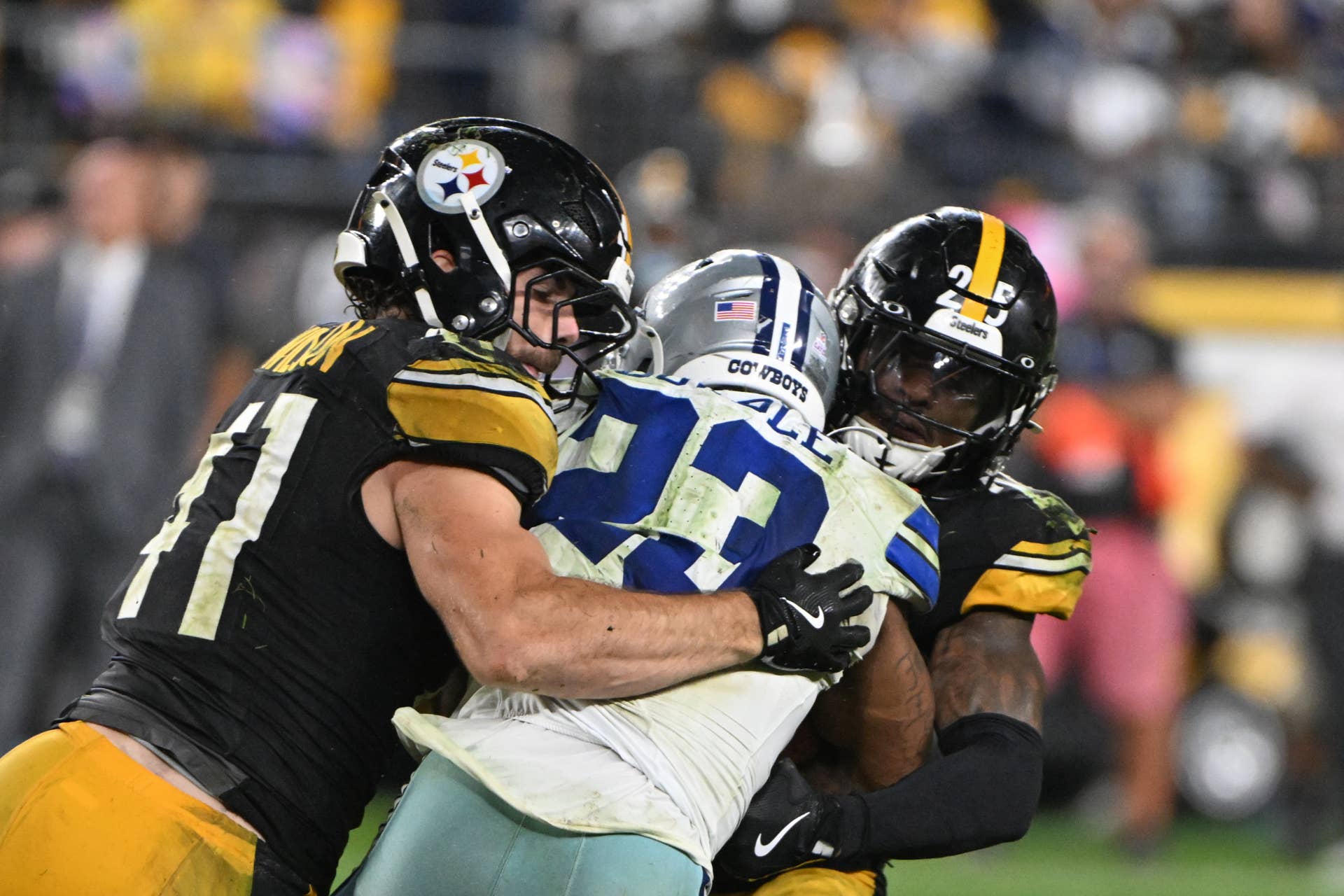
reuters.com,2024:newsml_MT1USATODAY24450717:214598972
SI Contradicts Itself in Its Rankings
The Steelers land in similar territory as the Green Bay Packers. Again, everyone's entitled to an opinion, but if you're going to evaluate uniforms one way, you need to apply that standard consistently. That isn't what happened here. The same rankings place the Dallas Cowboys at a baffling number three. The ranking itself isn't the problem, the reasoning behind it is. SI calls the Cowboys' look the most iconic and recognizable in the league, weaving the history of the Lone Star logo directly into its case.
If SI is going to apply historical context, it should apply it consistently. Should the Steelers crack the top five? That's debatable, and maybe not realistic. But should their history and ties to the Steel City factor into the ranking the way the Cowboys' did? Absolutely. Both uniforms are simple, both carry a traditional design that has lasted decades, and both run deep in their fan bases' identity.


